── Attaching core tidyverse packages ──────────────────────── tidyverse 2.0.0 ──
✔ dplyr 1.1.2 ✔ readr 2.1.4
✔ forcats 1.0.0 ✔ stringr 1.5.0
✔ ggplot2 3.4.2 ✔ tibble 3.2.1
✔ lubridate 1.9.2 ✔ tidyr 1.3.0
✔ purrr 1.0.1
── Conflicts ────────────────────────────────────────── tidyverse_conflicts() ──
✖ dplyr::filter() masks stats::filter()
✖ dplyr::lag() masks stats::lag()
ℹ Use the conflicted package (<http://conflicted.r-lib.org/>) to force all conflicts to become errors3 Introduction to Spatial Visualization - 1
Today we will be focusing on the practice of geospatial data visualization.
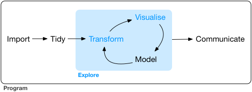
As a reminder, our framework for the workflow of data visualization is shown in Figure 14.1
3.1 Load and Install Packages
As a warmup, let’s load the tidyverse. Remember, you can check to make sure a package is loaded in your R session by checking on the files, plots, and packages panel, clicking on the Packages tab, and scrolling down to tidyverse to make sure it is checked.
3.1.1 Geospatial Packages
R has multiple packages that enable geospatial data visualization. Today, we create basic maps using the sf and leaflet. sf stands for Simple Features which is an open-source geographic information systems data format that works pretty well with tidyverse. Leaflet is an open-source library for mobile-friendly interactive maps.
As a reminder, when we first use a package, we need to install it locally. Let’s start by installing both packages. This only needs to be done once.
install.packages('sf')
install.packages('leaflet')Next, we load the packages to make sure they are available within the R environment.
Installing and loading packages like a boss!
3.2 Acquiring Data
We are going to acquire two datasets for testing today. The first dataset is the nc shapefile dataset that should be installed as part of the sf package. Unlike mpg, thisdataset is not directly available in the global environment.
We also will import geospatial environmental data set for our test examples. We are going to use a curated version of the CalEnviroscreen4.0 data. The data for the full state of California can be acquired as a zipped esri shapefile .shp. I’ve hosted a smaller version just for SoCal on my gitHub repository for this analysis. Downloading, unzipping, and then importing files is a big part of data science. Unfortunately, it has been my experience that having 15 people all have the same directory and file structures on 15 different machines is fraught with peril. I don’t want to troubleshoot that for an hour in class, so I tried to make the EZ mode code below.
3.2.1 North Carolina shapefile
We will read the data in using the sf function st_read and the base R function system.file.
-
st_read()is a specialized function that reads and loads in geospatial data files of various formats.
-
system_file()is a function that checks for files that are within system directories that have been loaded as packages. It searches within the package directories on your computer.
-
st_transform()is required to display the polygons properly inleafletin the WGS84 coordinate reference system.
We assign the North Carolina data we’re reading into a dataset using the <- operator. The <- operator tells R that the data we are loading should be placed into a dataset that we have named nc. In future functions, nc will access that underlying data within nc.
Lastly, there is the pipe operator %>% which is introduced in the magrittr package which is part of the core tidyverse. These magrittr pipes are amazing. I cannot express my love for the %>% in words alone. It allows existing data or information to be passed to the next line of code after some operation has been done on the data. The pipe operator says, ‘take the output from this line of code, and now do this next thing’. For now, take it on faith that this is the most useful operator in the tidyverse and will be littered throughout this course.
nc <- st_read(system.file("shape/nc.shp", package="sf")) %>%
st_transform("+proj=longlat +ellps=WGS84 +datum=WGS84")Reading layer `nc' from data source
`C:\Users\MichaelMcCarthy\AppData\Local\R\win-library\4.2\sf\shape\nc.shp'
using driver `ESRI Shapefile'
Simple feature collection with 100 features and 14 fields
Geometry type: MULTIPOLYGON
Dimension: XY
Bounding box: xmin: -84.32385 ymin: 33.88199 xmax: -75.45698 ymax: 36.58965
Geodetic CRS: NAD27We then use the head() function to print the first 5 rows of the nc dataset.
Pro tip: Always look at the data after import. Importing data is fraught with peril.
head(nc)Simple feature collection with 6 features and 14 fields
Geometry type: MULTIPOLYGON
Dimension: XY
Bounding box: xmin: -81.74091 ymin: 36.0729 xmax: -75.7728 ymax: 36.58973
CRS: +proj=longlat +ellps=WGS84 +datum=WGS84
AREA PERIMETER CNTY_ CNTY_ID NAME FIPS FIPSNO CRESS_ID BIR74 SID74
1 0.114 1.442 1825 1825 Ashe 37009 37009 5 1091 1
2 0.061 1.231 1827 1827 Alleghany 37005 37005 3 487 0
3 0.143 1.630 1828 1828 Surry 37171 37171 86 3188 5
4 0.070 2.968 1831 1831 Currituck 37053 37053 27 508 1
5 0.153 2.206 1832 1832 Northampton 37131 37131 66 1421 9
6 0.097 1.670 1833 1833 Hertford 37091 37091 46 1452 7
NWBIR74 BIR79 SID79 NWBIR79 geometry
1 10 1364 0 19 MULTIPOLYGON (((-81.47258 3...
2 10 542 3 12 MULTIPOLYGON (((-81.23971 3...
3 208 3616 6 260 MULTIPOLYGON (((-80.45614 3...
4 123 830 2 145 MULTIPOLYGON (((-76.00863 3...
5 1066 1606 3 1197 MULTIPOLYGON (((-77.21736 3...
6 954 1838 5 1237 MULTIPOLYGON (((-76.74474 3...3.2.2 Calenviroscreen4.0 geoJSON
The second dataset is hosted on the github repository where the class materials are version controlled. The code below names the internet URL where the data is stored as URL.path. If you go to the URL link, you will see the raw .geoJSON formatted spatial data file.
Next, we apply the same st_read() function to read the geoJSON file. geoJSON is a common format for encoding geographic data structures, and st_read() natively knows how to read it in. The st_transform() function again changes the polygons into the WGS84 coordinate reference system.
This time, we’ve named the dataset SoCalEJ.
Finally, we use the head() function on our SoCalEJ dataset to look at the first 5 rows.
URL.path <- 'https://raw.githubusercontent.com/RadicalResearchLLC/EDVcourse/main/CalEJ4/CalEJ.geoJSON'
SoCalEJ <- st_read(URL.path) %>%
st_transform("+proj=longlat +ellps=WGS84 +datum=WGS84")Reading layer `CalEJ' from data source
`https://raw.githubusercontent.com/RadicalResearchLLC/EDVcourse/main/CalEJ4/CalEJ.geoJSON'
using driver `GeoJSON'
Simple feature collection with 3747 features and 66 fields
Geometry type: MULTIPOLYGON
Dimension: XY
Bounding box: xmin: 97418.38 ymin: -577885.1 xmax: 539719.6 ymax: -236300
Projected CRS: NAD83 / California Albershead(SoCalEJ)Simple feature collection with 6 features and 66 fields
Geometry type: MULTIPOLYGON
Dimension: XY
Bounding box: xmin: -117.874 ymin: 33.5556 xmax: -117.7157 ymax: 33.64253
CRS: +proj=longlat +ellps=WGS84 +datum=WGS84
Tract ZIP County ApproxLoc TotPop19 CIscore CIscoreP
1 6059062640 92656 Orange Aliso Viejo 3741 9.642007 12.1028744
2 6059062641 92637 Orange Aliso Viejo 5376 10.569290 14.3343419
3 6059062642 92625 Orange Newport Beach 2834 3.038871 0.6807867
4 6059062643 92657 Orange Newport Beach 7231 6.538151 5.8497226
5 6059062644 92660 Orange Newport Beach 8487 8.873604 10.4009077
6 6059062645 92657 Orange Newport Beach 6527 6.033648 4.7402925
Ozone OzoneP PM2_5 PM2_5_P DieselPM DieselPM_P Pesticide
1 0.05165298 65.36403 9.445785 43.88301 0.14536744 50.13068 0.00000000
2 0.05219839 66.80772 9.785209 46.89484 0.07372588 27.41755 0.00000000
3 0.04827750 55.38270 10.433417 52.03485 0.03478566 12.40821 0.06496406
4 0.04901945 58.23273 10.013395 49.29683 0.03594981 12.90604 0.00000000
5 0.04863521 56.96329 10.565404 52.63223 0.07701293 28.73678 0.00000000
6 0.04863521 56.96329 10.329985 51.28811 0.04047264 14.58619 0.00000000
PesticideP Tox_Rel Tox_Rel_P Traffic TrafficP DrinkWat DrinkWatP
1 0.00000 293.8420 41.44786 999.0182 57.7125 177.3831 5.907331
2 0.00000 681.0703 57.65191 1051.9778 61.2250 312.7169 25.939803
3 22.58621 1557.6400 74.05601 874.8193 49.5000 332.6654 32.284251
4 0.00000 1349.2300 70.69267 1169.7532 67.4250 332.6654 32.284251
5 0.00000 1889.5133 78.03201 1383.9867 74.9500 332.6654 32.284251
6 0.00000 1589.1400 74.44361 1025.2790 59.5750 332.6654 32.284251
Lead Lead_P Cleanup CleanupP GWThreat GWThreatP HazWaste HazWasteP
1 18.450498 10.737240 0.0 0.000000 0.0 0.000000 0.280 46.80344
2 9.898042 3.730309 0.0 0.000000 0.0 0.000000 0.280 46.80344
3 14.263664 6.830498 4.5 40.836133 2.0 14.311805 0.150 26.67108
4 5.594984 1.600504 0.0 0.000000 0.5 2.722896 0.210 37.68365
5 16.777373 9.061122 0.0 0.000000 7.5 39.448780 0.395 60.22502
6 12.086059 5.343415 0.7 9.593132 2.0 14.311805 0.100 16.63799
ImpWatBod ImpWatBodP SolWaste SolWasteP PollBurd PolBurdSc PolBurdP Asthma
1 7 66.73667 0 0.00000 30.50123 3.724194 18.95457 21.70
2 7 66.73667 2 52.89805 35.23480 4.302163 29.71998 21.74
3 8 72.15456 0 0.00000 35.68847 4.357555 30.77785 14.93
4 6 58.69383 0 0.00000 30.97653 3.782228 19.87554 10.33
5 2 23.87652 2 52.89805 39.48486 4.821094 41.44368 13.88
6 3 33.15834 2 52.89805 32.98028 4.026885 24.04480 10.51
AsthmaP LowBirtWt LowBirWP Cardiovas CardiovasP Educatn EducatP
1 11.2786640 4.45 37.2337696 9.74 27.5049850 1.0 1.771703
2 11.3908275 3.50 16.2176033 8.72 18.8310070 8.4 35.876993
3 3.7263210 1.18 0.2950988 5.41 1.8569292 -999.0 -999.000000
4 0.9845464 5.39 61.9450860 4.46 0.3988036 2.0 5.859276
5 2.7542373 2.86 7.6597383 5.43 1.9192423 3.7 14.781068
6 1.0343968 4.64 42.1991275 4.65 0.4860419 0.0 0.000000
Ling_Isol Ling_IsolP Poverty PovertyP Unempl UnemplP HousBurd HousBurdP
1 1.1 7.375829 20.0 34.208543 3.0 17.113483 19.9 62.420786
2 4.4 33.942347 12.9 16.821608 2.6 11.868818 19.5 60.925222
3 0.0 0.000000 9.5 8.982412 0.9 1.145237 14.5 35.817490
4 3.9 30.694275 6.9 4.170854 2.6 11.868818 8.5 8.504436
5 5.0 37.664095 12.3 15.326633 4.0 30.882353 18.9 58.225602
6 1.0 6.266071 11.5 13.517588 -999.0 -999.000000 14.8 37.477820
PopChar PopCharSc PopCharP Child_10 Pop_10_64 Elderly65 Hispanic White
1 24.958604 2.5890185 13.2375189 10.9864 81.7696 7.2441 16.4662 63.2184
2 23.683405 2.4567389 11.7750882 13.2812 61.9792 24.7396 22.0238 55.2455
3 6.722867 0.6973798 0.2647504 5.9280 49.6471 44.4248 5.6104 89.6260
4 16.664505 1.7286508 4.9167927 7.9657 67.7361 24.2982 4.4530 63.9331
5 17.743511 1.8405788 5.8119012 10.4866 72.3224 17.1910 8.8488 82.0785
6 14.444279 1.4983412 3.3787191 11.0311 68.4388 20.5301 3.8302 74.7664
AfricanAm NativeAm OtherMult Shape_Leng Shape_Area AAPI
1 4.9452 0.0000 3.6087 5604.596 1467574 11.7616
2 1.3765 0.0000 3.5900 6244.598 2143255 17.7641
3 0.3881 0.0000 1.4467 6803.947 2048571 2.9287
4 0.0000 0.3042 6.0987 26448.643 18729420 25.2109
5 0.0000 0.0000 1.1076 10964.108 4361037 7.9651
6 0.2911 0.0000 0.8733 9833.066 5754643 20.2390
geometry
1 MULTIPOLYGON (((-117.7178 3...
2 MULTIPOLYGON (((-117.7166 3...
3 MULTIPOLYGON (((-117.8596 3...
4 MULTIPOLYGON (((-117.7986 3...
5 MULTIPOLYGON (((-117.8521 3...
6 MULTIPOLYGON (((-117.8269 3...Sometimes the data import messes up at the end of the dataset. A thorough scholar will use the tail function to check the bottom 5 rows as well.
In future classes, we may dive into the perilous world of file structures and directories. However, that is unfun, unrewarding, and gruesomely detail oriented, so we’ll avoid it for now.
3.2.3 Creating a New Geospatial Dataset
In addition to importing data, sometimes we just to create our own dataset. Let’s demonstrate how to create a very simple data frame in R for the latitude and longitude of a couple different locations we want to put on a map.
I want to show the location of this classroom at the Redford Conservancy and the neighborhood where I live.
I can use Google Earth or similar websites to get the latitude and longitude data. Latitude is North and South. Longitude is East and West.
- The Redford Conservancy is at 34.1100576 N and -117.710074 W.
- My zip code 92508 has a centroid at 33.8895145 N and -117.319014 W.
The code below will create a data frame which is an R data structure that has rows and columns. A data frame is a generic data object that can store tabular data of many different types.
We’ll use two base R functions to create the data frame, c() and data.frame().
-
c()- this function concatenates data. It is used to create a list. - ’data.frame()` - this function turns a list (or lists) into a data.frame type.
We assign latitude values to a variable named lat, and a longitude values to a variable named lng. We use c() because we have multiple values that we want to include. We combine them into the locations data.frame. Then we check it worked by typing locations.
lat <- c(34.1100576, 33.8895145)
lng <- c(-117.710074, -117.319014)
locations <- data.frame(lat, lng)
locations lat lng
1 34.11006 -117.7101
2 33.88951 -117.31903.2.3.1 Exercise 1
- Find another location’s latitude and longitude coordinates that you want to add to a map.
- Hack the code to add your location of interest to the two existing
locationsdata.frame. - Display the output of the
locationsdata.frame to show that your code worked!
3.3 Visualize the Data - Geospatial Edition
3.3.1 Choose the visualization type
We’ll be exploring leaflet() maps for our visualizations. Leaflet has a number of in-built display functions for geospatial data that make things look really cool. I will note that ggplot can make maps too with geom_sf() and other functionality, but I prefer the leaflet tiles for interactive maps as a superior visualization tool.
3.3.2 Choose the visualization function
-
leaflet()addTiles()addMarkers()addPolygons()addLegends()
We’ll apply leaflet() to every visualization for geospatial data today, and add at least one add function to display spatial information.
3.3.3 Write the code for a basic geospatial visualization
Leaflet is a super cool package for making interactive maps with very few lines of code. As before let’s start with basics and then iterate.
Note that Leaflet has a different style and coding aesthetic than ggplot, so some of the syntax and grammar is a bit different. However, the steps are the same as for ggplot.
- Add a verb or two for an action - usually this is the function.
- Add an object to apply the action to - this is usually the dataframe, but can be a list or another type of data object.
- Add adjectives and adverbs to modify the action or the object
3.3.3.1 Example 1 - Basic Tile Map
Figure 3.2 shows the standard leaflet map with a minimal reproducible example. This map shows the whole world in a Mercator projection. The map is interactive, just like most of the maps you come across in standard apps and websites on the modern internet. You can zoom in and see the details of an area like Los Angeles, with all the annotation and standard roads, forests, city names, etc.
The code is simply two lines with two actionable functions.
-
leaflet()- this function identifies the type of visualization. -
addTiles()- this function tells the leaflet map to display the default visualization ‘tile’. Tiles are the way geospatial data are rendered depending on the zoom level that makes it work for not displaying too much detail as you zoom out.
A map is useful by itself, but we have not added any information to it. A map alone is not going to be useful as a visualization unless we add some data.
3.3.3.2 Example 2. Tile Map with Location Markers
Remember that locations data frame we created earlier. Let’s add that to the map.
addMarkers() is a useful function to add point data to a map.
Figure 3.3 shows the map with my two locations on it added as markers. We added another line of code with a pipe operator to put the locations data on the map.
leaflet() %>%
addTiles() %>%
addMarkers(data = locations)Whoot! A map with locations! And now the spatial extent of the map defaults to just show an area that encompasses the markers in the locations dataset. If your location that you added to the dataset happens to be outside California, your map will be zoomed way out compared to someone who only includes locations in SoCal.
I purposely made the column names lat and lng because then we don’t have to assign those variables in the addMarkers call. If your columns are named something else (e.g., Lati or long), leaflet will need to be told that those are the correct columns to look for.
3.3.3.3 Example 3. North Carolina Counties on a Tile Map
Going beyond point locations, geospatial data really shines when we display shapes. We’ll start by displaying the nc dataframe.
addPolygons() is the function used to display polygons.
Figure 3.4 shows the North Carolina counties.
leaflet() %>%
addTiles() %>%
addPolygons(data = nc)We have done it!
3.3.3.4 Exercise 2
- Make a leaflet map with the SoCalEJ dataset. It should look like Figure 3.5.
3.3.4 Improve the Visualization
The basic visualization is in need of some improvement. First let’s explore colors, fillcolors, stroke, and opacity.
Within the addPolygons() function, there are many options that can be modified to alter the output from the default settings. We won’t cover all these options today.
colorweightopacityfillColorfillOpacitystrokegrouplabel
Let’s iterate and make some improvements!
Figure 3.6 shows what happens we just change the color from blue to black. Both the fill and line color are changed.
leaflet() %>%
addTiles() %>%
addPolygons(data = nc, color = 'black')The lines are too heavy. Let’s lower the weight - we’ll let the color go back to blue to keep the example minimal.
Figure 3.7 shows the result, which is a much cleaner look.
leaflet() %>%
addTiles() %>%
addPolygons(data = nc, weight = 1)Much better!
Within the North Carolina dataset are some numerical values by county. Let’s use fillcolor the counties to indicate the values.
Unfortunately, leaflet requires us to do a bit of coding on our color palette.
Functions that help define the color palette in leaflet are
-
colorNumeric()- a linear color scale -
colorQuantile()- a color scale that makes sure the bin sizes are approximately equal -
colorFactor()- a color scale that is good for categorical (‘non-numeric’) data
This creates a numeric color palette for the BIR79 category of data for North Carolina in a numeric and quantile format. I have chosen the YlGn palette from Figure 1.6.
pal1 <- colorNumeric(palette = 'YlGn', domain = nc$BIR79)
pal2 <- colorQuantile(palette = 'YlGn', domain = nc$BIR79, n = 5)Now we see what those two palettes look like in the map. Figure 3.8 shows the default numeric palette, but it is too faint with the background tiles.
leaflet() %>%
addTiles() %>%
addPolygons(data = nc,
weight = 1,
fillColor = ~pal1(BIR79))Increasing the fillOpacity to 0.8 will help us to see the data much better. Also, let’s remove the lines completely by setting stroke to FALSE. Figure 3.9 shows
leaflet() %>%
addTiles() %>%
addPolygons(data = nc,
stroke = FALSE,
fillColor = ~pal1(BIR79),
fillOpacity = 0.8)That has a much better pop and we can really see the county differences in the high and low population areas.
Figure 3.10 shows the quantile binned palette pal2. Now the number of counties in each color bin is about the same, which helps to sort the differences among the lowest population counties.
leaflet() %>%
addTiles() %>%
addPolygons(data = nc,
stroke = FALSE,
fillColor = ~pal2(BIR79),
fillOpacity = 0.8)3.3.5 Exercise 3
- Select a different color palette from Figure 1.6 to replace ‘YlGn’ in pal1.
- Generate a North Carolina map with your choice of color palette for the BIR79 category.
3.3.5.1 Adding a Legend
The existing map is not bad, but the color scale is not self-explanatory. We need to add a legend so a user can understand the data scale.
addLegend() will provides that functionality.
Figure 3.11 shows the legend overlay with the map. Note that we need to either move the data = nc into the initial call to leaflet() or define it separately in both the addPolygons and addLegend functions.
The addLegend polygon require the inputs for pal and values. Defining the color palette pal1 and the values of the scale ~BIR79 are required. The title is optional, but the scale doesn’t make much sense without a description.
leaflet(data = nc) %>%
addTiles() %>%
addPolygons(stroke = FALSE,
fillColor = ~pal1(BIR79),
fillOpacity = 0.8) %>%
addLegend(pal = pal1,
title = 'Births in 1979',
values = ~BIR79)3.3.5.2 Exercise 4
- Create a colorPalette for a SoCalEJ dataset variable. Choose one of the following numerical variables and a colorPalette from Figure 1.6
- Poverty
- Hispanic
- AfricanAm
- Ozone
- DieselPM_P
- Create a map for the SoCalEJ dataset with census tracts color coded for your chosen category of the following categories:
- Add a Legend to the map
That map might look like Figure 15.3.
palDPM <- colorNumeric(palette = 'YlOrBr', domain = SoCalEJ$DieselPM_P, n = 5)
leaflet(data = SoCalEJ) %>%
addTiles() %>%
setView(lat = 34, lng = -117.60, zoom = 9) %>%
addPolygons(stroke = FALSE,
fillColor = ~palDPM(DieselPM_P),
fillOpacity = 0.8) %>%
addLegend(pal = palDPM,
title = 'Diesel Particulate Matter (%)',
values = ~DieselPM_P)