Today we focus on the practice of exporting completed visualizations
In order to communicate using visualization, one usually needs to save it to a form that can be used to communicate. Today will focus on static images but there are options for interactive formats like HTML or Shiny that embed interactivity.
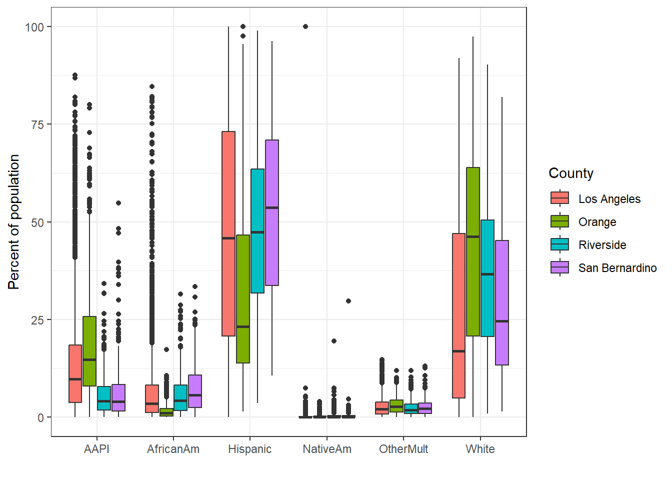
I will start with one of our pretty ggplot examples from Chapter 11. Let’s remix the racial and ethnic population percentage by census tract and county. Figure 15.1 shows the figure.
SoCal_narrow%>%filter(variable%in%c('Hispanic', 'White', 'AfricanAm','NativeAm', 'OtherMult', 'AAPI'))%>%ggplot(aes(x =variable, y =value, fill=County))+geom_boxplot()+theme_bw()+labs(x ='', y ='Percent of population')
Figure 15.1: Racial and ethnic population distribution by county in SoCal census tracts.
15.5 Exporting Visualizations
15.5.1 Option 1 - Point and Click
The point and click option is available after one creates a visualization.
Go to the files, plots, and packages panel of RStudio.
Click on the Plots tab.
Click on the Export button as shown in Figure 15.2
Choose whether to Save as Image or Save as PDF.
Rename file save to something more descriptive than RPlot
Click Save
File should now be saved to your working directory - getwd() will identify that path, and it should be accessible through the Files tab of the
Figure 15.2: Export button is here on my machine
15.5.2 Option 2. For ggplot() files, use ggsave()
This is pretty straightforward and a bit more reproducible and customizable than the manual point and click process. A minimal example of a .png export is shown below.
One can then go to the Files panel, sort by modified and there should be a file named boxplot.png. Note that ggsave() defaults to saving the last image created.
One can save files as a variety of image formats, with specified dimensions.
ggsave(filename ='boxplot.jpg', width =5, height =4, units ='in')
There are a number of export options within ggsave(), but the defaults should be pretty good for now.
Lastly, it can sometimes be important to directly save a ggplot within R. Then one can manually assign the exact image file to export. The code below demonstrates this, and is most important when automating exporting many (e.g., 100s) of images.
Vis<-SoCal_narrow%>%filter(variable%in%c('Hispanic', 'White', 'AfricanAm','NativeAm', 'OtherMult', 'AAPI'))%>%ggplot(aes(x =variable, y =value, fill=County))+geom_boxplot()+theme_bw()+labs(x ='', y ='Percent of population')ggsave('boxplot.pdf', plot =Vis)
Saving 7 x 5 in image
In this third example, we assign the image to the pointer Viz. Then the ggsave() option plot = is used to assign the image to save the file Viz to a .pdf export.
15.6 Leaflet Visualization - Static
First, I am going to map Diesel PM for the SoCalEJ dataset in Leaflet. Figure 15.3 is the result.
Repeat similar steps as shown in Section 15.5.1. Here are the steps for exporting an interactive HTML map manually.
Go to the files, plots, and packages panel of RStudio.
Click on the Plots tab.
Click on the Export button as shown in Figure 15.2
Choose to Save as Web Page.
Rename file save to something more descriptive than RPlot
Click Save
File should now be saved to your working directory - getwd() will identify that path, and it should be accessible through the Files tab. On my machine it also loads directly into my default web browser.
15.6.2 Option 2. htmlwidgets package for exports
As always, there is a package to do a specific thing that be done point and click style. htmlwidgets provides the saveWidget() function for exporting leaflet maps as HTML.