Check your email for a very long api key. Copy that key.
Run the following line of code to activate your key for the session. The key is used in every request to access data from the census API (application programming interface).
# Replace <YOUR KEY HERE> with the key from the census data api servicecensus_api_key('<YOUR KEY HERE>', install =TRUE)
17.2 Import Geospatial Census data
tidycensus allows one to pull specific geospatial census datasets quickly into R for use in mapping and visualization applications. This should be pretty good for the individual and group projects.
First, we need to alter a setting in the options to allow R to directly import geospatial files from the census API.
tidycensus accepts state names (e.g. “Wisconsin”), state postal codes (e.g. “WI”), and state FIPS codes (e.g. “55”), so a user can choose what they are most comfortable with.
First, let’s pull a census tract dataset to show how it works and how it quickly gets us spatial information. I will start with an example from Los Angeles County. We are pulling American Community Survey data using get_acs(). The arguments are state, county, geography - which we choose as census tract, variable - which we choose as B19013_001 which is median income, geometry, and year.
LA<-get_acs( state ="CA", county ="Los Angeles", geography ="tract", variables ="B19013_001", geometry =TRUE, year =2020)
Now let’s map it using leaflet. I want to show the median income as a filled color and I’ll choose the viridis palette. Remember to define the color palette first. Figure 17.1 shows the result.
Figure 17.1: Median income for 2015-2020 for Los Angeles County - data from the ACS
The variables that are available from the U.S. census can be perused using the following code bits. See the tidycensus page for more details. There are 25,000+ variables to choose from and it goes a bit too deep to go into those here.
# A tibble: 6 × 4
  name       label                                   concept    geography
  <chr>      <chr>                                   <chr>      <chr>
1 B01001_001 Estimate!!Total:                        SEX BY AGE block group
2 B01001_002 Estimate!!Total:!!Male:                 SEX BY AGE block group
3 B01001_003 Estimate!!Total:!!Male:!!Under 5 years  SEX BY AGE block group
4 B01001_004 Estimate!!Total:!!Male:!!5 to 9 years   SEX BY AGE block group
5 B01001_005 Estimate!!Total:!!Male:!!10 to 14 years SEX BY AGE block group
6 B01001_006 Estimate!!Total:!!Male:!!15 to 17 years SEX BY AGE block group
#View(v20)
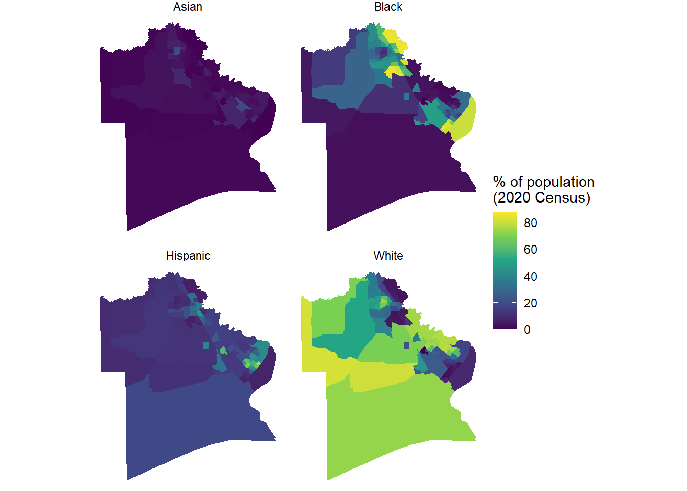
17.2.2 Example 2 - Jefferson County, Texas - Racial variables
Knowing income is nice, but a lot of the Environmental (in)Justice section was also focused on racial and ethnic variables. Here’s an example for Jefferson County, Texas to pull decennial census data on racial composition at the county census tract level.
# These are the list of racial variables from the decennial censusracevars<-c(White ="P2_005N", Black ="P2_006N", Asian ="P2_008N", Hispanic ="P2_002N")JeffCo<-get_decennial( geography ="tract", variables =racevars, state ="TX", county ="Jefferson County", geometry =TRUE, summary_var ="P2_001N", year =2020)head(JeffCo)
Simple feature collection with 6 features and 5 fields
Geometry type: MULTIPOLYGON
Dimension:     XY
Bounding box:  xmin: -94.13939 ymin: 29.86557 xmax: -93.92767 ymax: 30.06859
Geodetic CRS:  NAD83
# A tibble: 6 × 6
  GEOID       NAME        variable value summary_value                  geometry
  <chr>       <chr>       <chr>    <dbl>         <dbl>        <MULTIPOLYGON [°]>
1 48245002100 Census Tra… White       97          2983 (((-94.13939 30.05566, -…
2 48245002100 Census Tra… Black     1940          2983 (((-94.13939 30.05566, -…
3 48245002100 Census Tra… Asian       23          2983 (((-94.13939 30.05566, -…
4 48245002100 Census Tra… Hispanic   851          2983 (((-94.13939 30.05566, -…
5 48245006100 Census Tra… White       25          1055 (((-93.95282 29.87938, -…
6 48245006100 Census Tra… Black      874          1055 (((-93.95282 29.87938, -…
Data looks good. Figure 17.2 shows a facet wrap display of the racial data. This is a very modest remix of the example from the tidycensus spatial data example for Harris County.
Figure 17.2: Racial demographic information for Jefferson County, Texas from the decennial census for 2020.
This is a good start, especially if one overlaid the location of major petrochemical facilities from the TRI dataset on it.
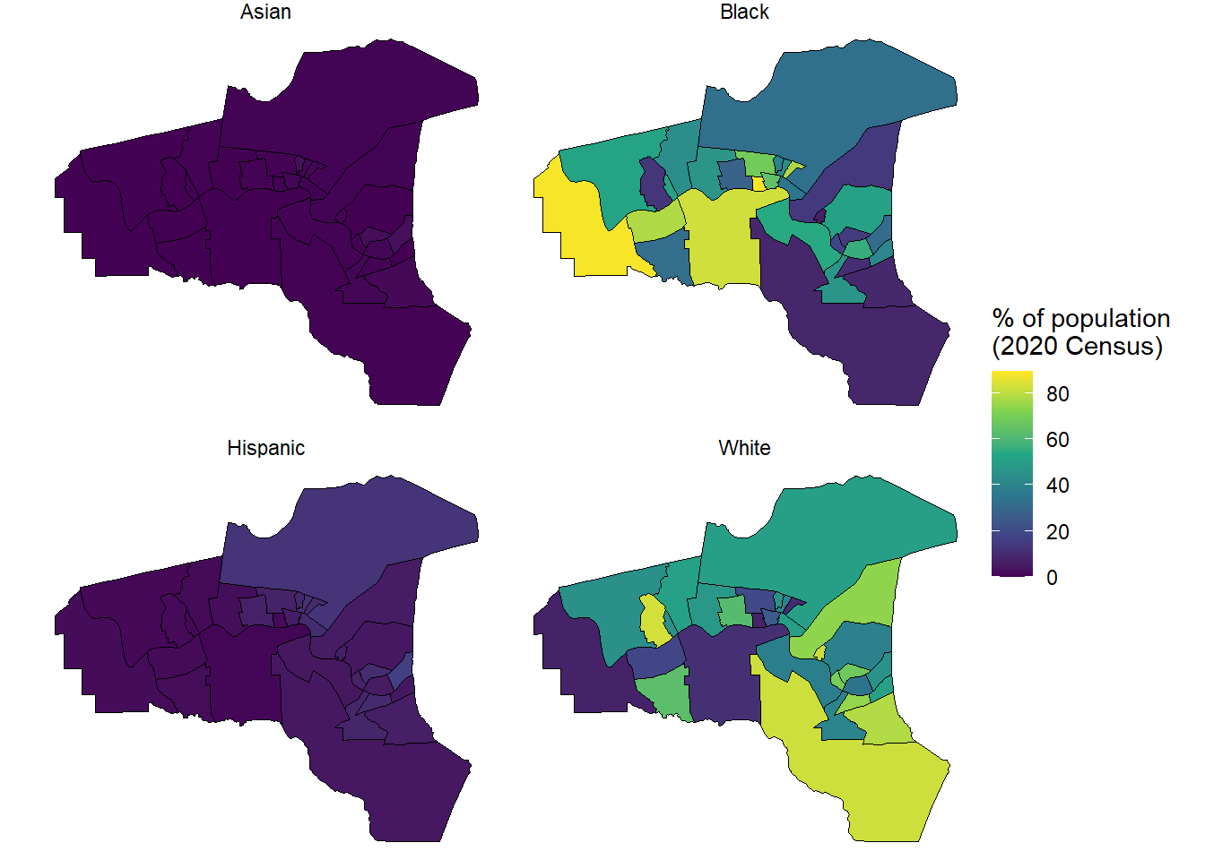
17.2.3 Example from Cancer Alley
TorHoerman Law identifies three parishes in Louisiana as part of cancer alley - St. Charles, St. James, and St. John the Baptist.
Can we pull and display three parishes (i.e., Louisiana county equivalents) simultaneously?
#Note, we use the same racial demographic variables in previous example#Combine the three parishes into a single list for pullingparishes<-c('St. John the Baptist','St. James','St. Charles')CancerAlley<-get_decennial( geography ="tract", variables =racevars,#change the state state ="LA",#change the county county =parishes, geometry =TRUE, summary_var ="P2_001N", year =2020)head(CancerAlley)
Simple feature collection with 6 features and 5 fields
Geometry type: MULTIPOLYGON
Dimension:     XY
Bounding box:  xmin: -90.54614 ymin: 30.04627 xmax: -90.47054 ymax: 30.10198
Geodetic CRS:  NAD83
# A tibble: 6 × 6
  GEOID       NAME        variable value summary_value                  geometry
  <chr>       <chr>       <chr>    <dbl>         <dbl>        <MULTIPOLYGON [°]>
1 22095070800 Census Tra… White      147          1930 (((-90.54614 30.07102, -…
2 22095070800 Census Tra… Black     1727          1930 (((-90.54614 30.07102, -…
3 22095070800 Census Tra… Asian        0          1930 (((-90.54614 30.07102, -…
4 22095070800 Census Tra… Hispanic    32          1930 (((-90.54614 30.07102, -…
5 22095070300 Census Tra… White     2497          6123 (((-90.5018 30.07859, -9…
6 22095070300 Census Tra… Black     2655          6123 (((-90.5018 30.07859, -9…
The data looks promising. Opening the new CancerAlley table shows that there are census tracts from each of the parishes listed. Figure 17.3 shows the same style of display for Cancer Alley as display for Jefferson County, TX. Note that Ascenscion and Iberville Parishes may warrant inclusion as well.
CancerAlley%>%#Create a percent variable for the four racial categoriesmutate(percent =100*(value/summary_value))%>%ggplot(aes(fill =percent))+facet_wrap(~variable)+#included tract lines for claritygeom_sf(color ='black')+theme_void()+scale_fill_viridis_c()+labs(fill ="% of population\n(2020 Census)")
Figure 17.3: Racial demographic information for Cancer Alley from the decennial census for 2020.
I looked through some of the sources of data the Debt Team was trying to access. I am not a water domain expert, so I wanted simpler data sources. The LA County Open Data Portal has a set of Hydro data layers that may be of use.
The page contains a direct URL to the spreadsheet. Unfortunately, it is a very long name and that breaks Windows naming ability which restricts pathnames to 256 characters, so I’ll just show the manual method.
Download file - mine was named health_facility_locations.xlsx
Figure 17.5: Licensed healthcare facilities in California
Reminder - latitude and longitude have to be defined as arguments in leaflet if they don’t match the expected convention of lat and lng. We could have renamed the values in the spreadsheet as an alternative.
The clusterOptions argument provides a nice grouping to make the map a bit less busy at zoomed out levels of the interactive map. This can be useful for a busy dataset like this at a state level.