install.packages('ggthemes')5 Chartjunk, Data-Ink Ratios, and Visualization Theory
Today we will be focusing on the theory of data visualization.
5.1 Chartjunk
Chart Junk is a term first used by Edward Tufte in his book The Quantitative Display of Visual Information. He defined it as:
The interior decoration of graphics generates a lot of ink that does not tell the viewer anything new. The purpose of decoration varies-to make the graphic appear more scientific and precise, to enliven the display, to give the designer an opportunity to exercise artistic skills. Regardless of its cause it is all non-data-ink or redundant data-ink, and it is often chartjunk.
In other words, Tufte believes that embellishment, decoration, and ornamentation is typically bad in a data visualization. While I can talk about this, it is better to just show examples of chartjunk.
Just do an image search for chartjunk in your browser. Here’s a few examples.
Figure 5.1 shows a very simple bar chart with lots of colors, patterns, and

Figure 5.2 shows a price line chart embellished with a decorative reclining lady. This is what Tufte calls a Duck - elevating design over data.
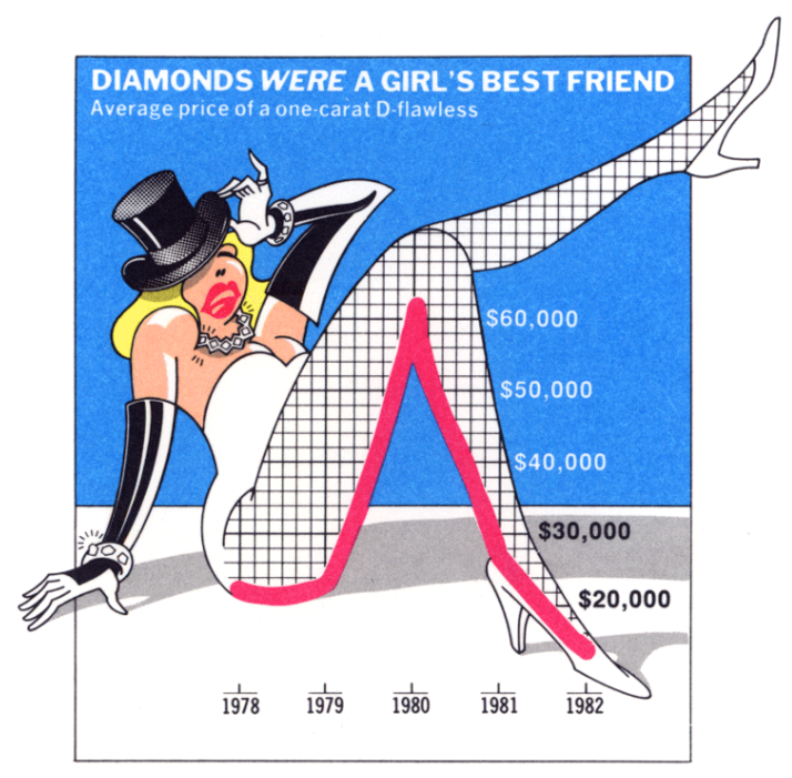
Figure 5.3 shows a pie chart of video analysis by medical professionals. Only three values are shown, yet there is a flourish of colors, cartoons, clipart, and embellishment.

Tufte was pretty crufty about anything that was not minimalist. He is an pro-modernist design and anti-baroque design. And there is some research that suggests more ornamented and interesting visualizations stick with people longer than minimal designs.
5.2 Data-Ink Ratios
The second Tufte-ism is the ratio of data-ink. This is a quantitative measure indicating the amount of ‘ink’ used to convey data/information in a visualization. Any ‘ink’ not conveying information is considered superfluous and redundant.

A simple example from the tidyverse would be to compare the default theme for a ggplot() with theme_bw() or theme_minimal().
Here’s Figure 4-2 with the default theme. Notice all that background ‘ink’ in gray.
Tufte would definitely prefer Figure 4-5 where we removed all that background and even the frame around the outside of the map.
This is an aesthetic preference, especially in the modern era where almost all of the visualization we engage with is on a computer/tablet/phone. There is no amount of pixel-ink that is consumed. And in some cases the brightness of a white background may be antithetical and harmful, such as in the ProPublica Sacrifice Zone visualizations (Assignment 5 in Unit 2).
5.3 ggthemes
Let’s make some variations on a figure.
── Attaching core tidyverse packages ──────────────────────── tidyverse 2.0.0 ──
✔ dplyr     1.1.2     ✔ readr     2.1.4
✔ forcats   1.0.0     ✔ stringr   1.5.0
✔ ggplot2   3.4.2     ✔ tibble    3.2.1
✔ lubridate 1.9.2     ✔ tidyr     1.3.0
✔ purrr     1.0.1
── Conflicts ────────────────────────────────────────── tidyverse_conflicts() ──
✖ dplyr::filter() masks stats::filter()
✖ dplyr::lag()    masks stats::lag()
ℹ Use the conflicted package (<http://conflicted.r-lib.org/>) to force all conflicts to become errorsLet’s use the mpg data. Let’s remind ourselves what it contains.
head(mpg)# A tibble: 6 × 11
manufacturer model displ year cyl trans drv cty hwy fl class
<chr> <chr> <dbl> <int> <int> <chr> <chr> <int> <int> <chr> <chr>
1 audi a4 1.8 1999 4 auto(l5) f 18 29 p compa…
2 audi a4 1.8 1999 4 manual(m5) f 21 29 p compa…
3 audi a4 2 2008 4 manual(m6) f 20 31 p compa…
4 audi a4 2 2008 4 auto(av) f 21 30 p compa…
5 audi a4 2.8 1999 6 auto(l5) f 16 26 p compa…
6 audi a4 2.8 1999 6 manual(m5) f 18 26 p compa…And now we use our code from Figure 2.3 to make a really basic scatter plot of engine displacement and highway miles per gallon.
Figure 5.4 shows a very basic visualization.
ggplot(data = mpg) +
  geom_point(aes(x = displ, y = hwy))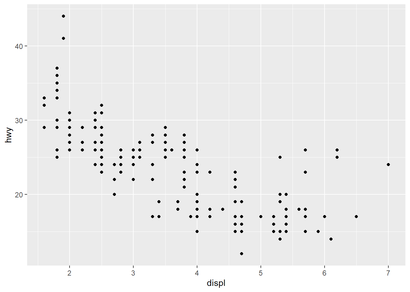
Now let’s explore some ggtheme variations! Let’s try theme_economist()
Figure 5.5 shows that bit of code.
ggplot(data = mpg) +
  geom_point(aes(x = displ, y = hwy)) +
  theme_economist()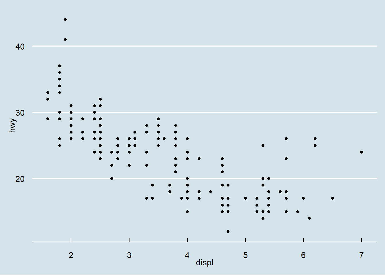
Now let’s add in the colors for the individual points. Remember how we did this in Figure 2.6? Let’s see how that looks within the economist theme.
Figure 5.6 shows the initial attempt.
ggplot(data = mpg) +
  geom_point(aes(x = displ, y = hwy, color = class))+
  theme_economist()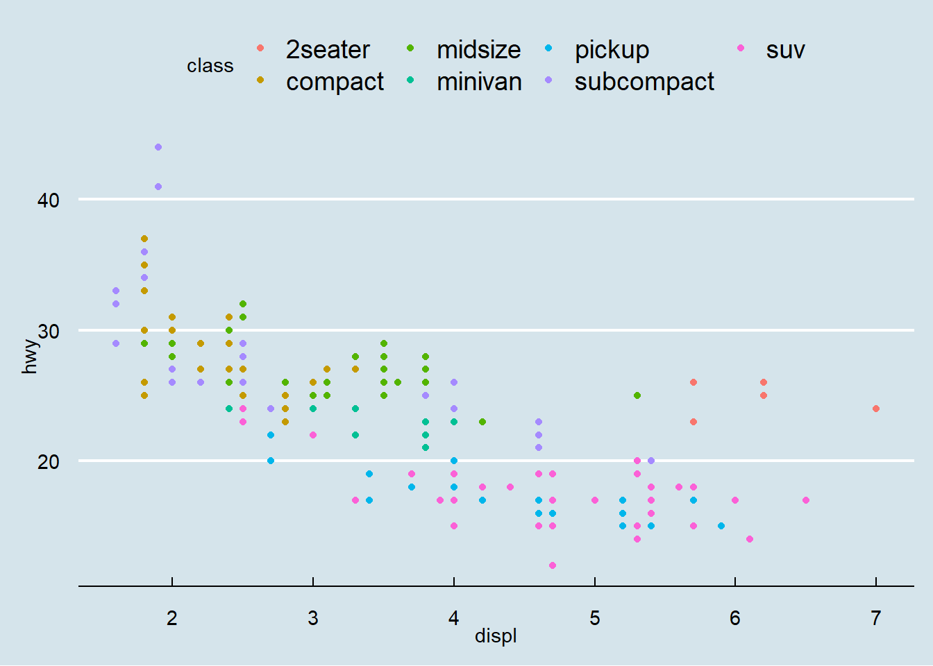
However, if we look at the vignette for ggtheme, it shows that there is a color scale for that theme as well. Let’s try to apply that.
Figure 5.7 shows that result.
ggplot(data = mpg) +
  geom_point(aes(x = displ, y = hwy, color = class))+
  theme_economist() +
  scale_color_economist()
One last iteration - I hate the axis labels. The labs() function allows us to rename labels and add titles. We’ll fix the x, y labels for now, but we can also do title and color to revise those. You’ll get to try that yourself in a minute.
Figure 5.8 shows an updated axis label figure with the economist theme.
ggplot(data = mpg) +
  geom_point(aes(x = displ, y = hwy, color = class))+
  theme_economist() +
  scale_color_economist() +
  labs(x = 'Engine displacement (Liters)', y = 'Highway (miles per gallon)')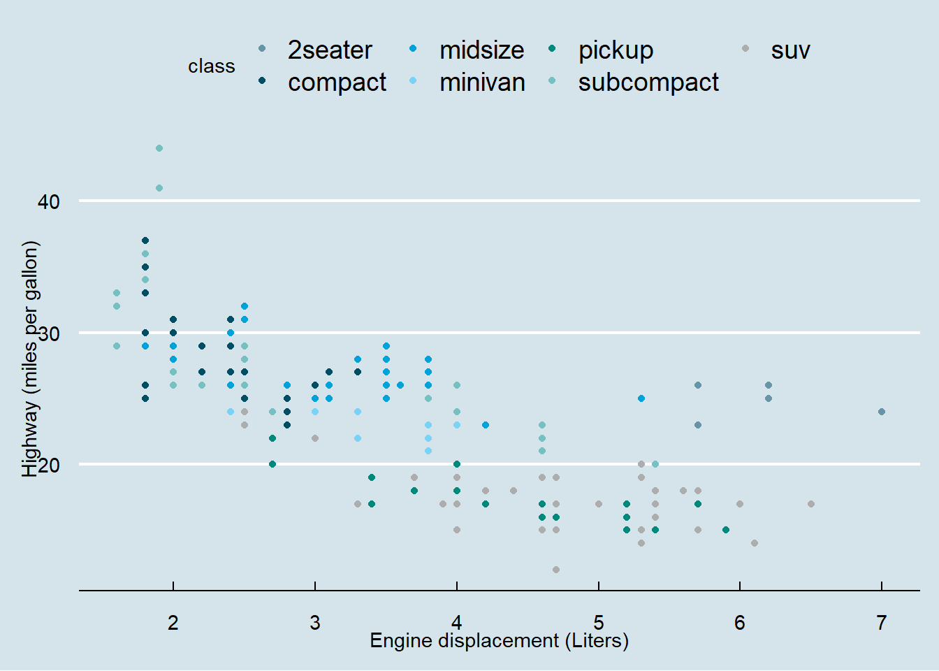
5.3.1 Class Exercise 1 -
Create a figure using a different theme from ggthemes 1 - start with a basic visualization 2 - pick a theme from ggthemes - or type theme_ into RStudio text editor panel and a pop-up window should display your options. 3 - test 4 themes and pick your favorite (most handsome or horrific) 4 - implement an mpg figure with something other than displ and hwy as your columns and a theme - color scheme. Please do it stepwise! 5 - share your discoveries with your adjacent colleagues
5.4 Class Exercise 2 - Visualization Theory
Here’s a framework for visualization from the Junk Charts Blog. Have a quick read of that blog.
- What is the practical question?
- What does the data you have say about the question?
- What do the individual visualizations say?
I would add:
- Who is the audience for the visualization?
5.5 Discussion -
Project work
- Individual visualization ideas
- Group project interests