install.packages('gganimate')
install.packages('gifski')20 Animations - Two ways
Today we focus on animating visualizations in R
20.1 Animations
Visualizations that include movement are a another way of creating salience. However, a bad animation doesn’t add anything to the visualization and just requires more time to view the same information than a good information.
First, let’s show a couple of examples using gganimate which works to extend the grammar of ggplot2. Then we will also show a couple of examples using shiny and its sliderInput() animation.
20.2 Packages and libraries
Install gganimate and gifski. Apple computers may default to image-magick, but I can’t test that.
Load libraries used for visualization today.
── Attaching core tidyverse packages ──────────────────────── tidyverse 2.0.0 ──
✔ dplyr     1.1.2     ✔ readr     2.1.4
✔ forcats   1.0.0     ✔ stringr   1.5.0
✔ ggplot2   3.4.2     ✔ tibble    3.2.1
✔ lubridate 1.9.2     ✔ tidyr     1.3.0
✔ purrr     1.0.1
── Conflicts ────────────────────────────────────────── tidyverse_conflicts() ──
✖ dplyr::filter() masks stats::filter()
✖ dplyr::lag()    masks stats::lag()
ℹ Use the conflicted package (<http://conflicted.r-lib.org/>) to force all conflicts to become errorsLinking to GEOS 3.9.3, GDAL 3.5.2, PROJ 8.2.1; sf_use_s2() is TRUE
20.3 gganimate
20.3.1 Contrived example - Keeling Curve at Mauna Loa
In Lecture 1 we plotted the growing concentration of CO2 at Mauna Loa, the famous Keeling Curve.
Let’s revisit that.
First, import the data from NOAA CMDL.
#read raw data
co2 <- read_table('https://www.gml.noaa.gov/webdata/ccgg/trends/co2/co2_mm_mlo.txt',
                  skip = 57 )
#fix column headers
fieldNames <- c('year', 'month', 'decDate', 'meanCO2', 'trendedCO2', 'days', 'stdev', 'unc')
colnames(co2) <- fieldNames
# check dataset back rows
tail(co2)
# A tibble: 6 × 8
year month decDate meanCO2 trendedCO2 days stdev unc
<dbl> <dbl> <dbl> <dbl> <dbl> <dbl> <dbl> <dbl>
1 2022 10 2023. 416. 419. 30 0.27 0.1
2 2022 11 2023. 418. 420. 25 0.52 0.2
3 2022 12 2023. 419. 420. 24 0.5 0.2
4 2023 1 2023. 419. 419. 31 0.4 0.14
5 2023 2 2023. 420. 419. 25 0.62 0.24
6 2023 3 2023. 421 420. 31 0.74 0.25Next, let’s create a relatively simple visualization of the Keeling Curve using ggplot2. Figure 20.1 shows the result.
  ggplot(data = co2, aes(x = decDate, y = meanCO2)) +
  geom_point(color = 'black', size = 1) +
  theme_bw() +
  labs(x = 'Year', y = 'Concentration of CO2 (ppm)', 'Keeling Curve @ Mauna Loa')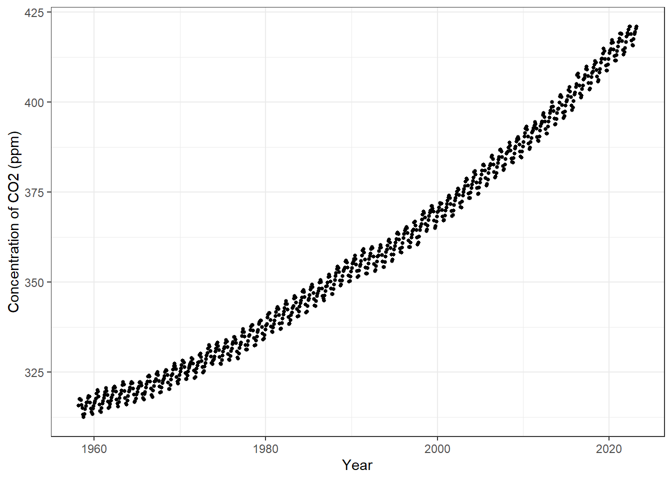
20.3.2 Add in the animation steps
In many environmental data sets, we will want to show changes over time. gganimate has a built-in function for time animations called [transition_time()](https://gganimate.com/reference/transition_time.html).
Let’s do the most super-basic animation and add that function to the Keeling Curve visualization. Figure 20.2 shows the most basic animation when adding a time increment.
ggplot(data = co2, aes(x = decDate, y = meanCO2)) +
  geom_point(color = 'black', size = 1) +
  theme_bw() +
  labs(x = 'Year', y = 'Concentration of CO2 (ppm)', 'Keeling Curve @ Mauna Loa') +
  transition_time(year)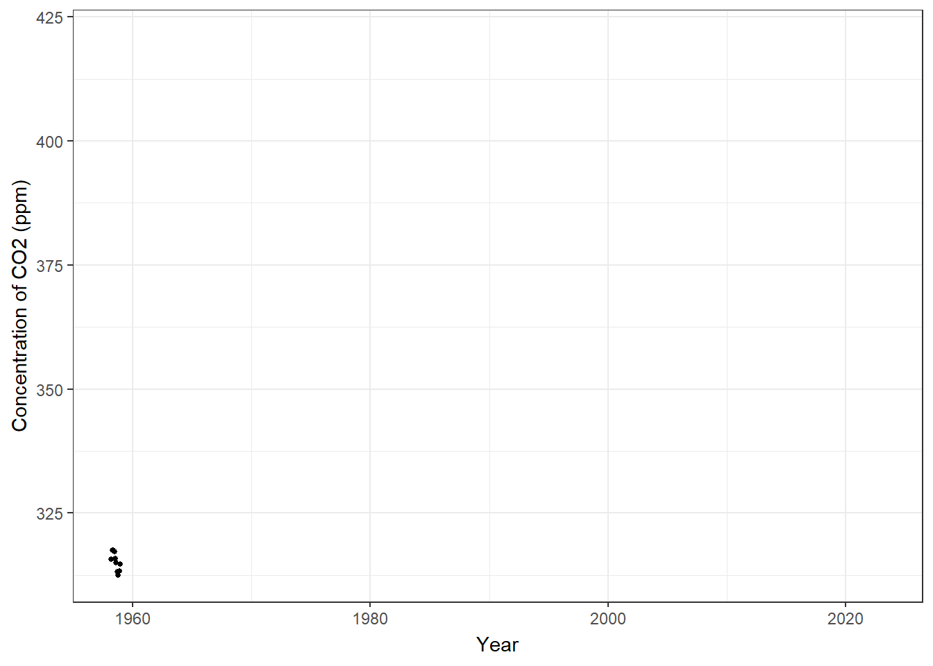
Pretty cool, but we don’t see the old data so it looks just like a migrating flock of points. If we want to show other points along the graph, we can use shadow_mark() to show other points along the graph. Arguments for past and future allow us to choose include either or both of those points.
shadow_mark(past = TRUE, future = FALSE, ..., exclude_layer = NULL)
Figure 20.3 shows the result, while adding in a color argument to shadow_mark to show the old data differently.
ggplot(data = co2, aes(x = decDate, y = meanCO2)) +
  geom_point(color = 'black', size = 1) +
  theme_bw() +
  labs(x = 'Year', y = 'Concentration of CO2 (ppm)',
       title = 'Year: {frame_time}') +
  transition_time(year) +
shadow_mark(past = TRUE, color = 'gray') 
Pretty close, but that Year title is horrible and the significant figures makes my brain hurt. I can and must fix that using the round() function.
The interesting thing about that curly bracket notation is it can deal with variables and code directly. So let’s modify that directly.
Figure 20.4 shows the fixed title.
ggplot(data = co2, aes(x = decDate, y = meanCO2)) +
  geom_point(color = 'black', size = 1) +
  theme_bw() +
  labs(x = 'Year', y = 'Concentration of CO2 (ppm)',
       title = 'Year: {round(frame_time, 0)}') +
  transition_time(year) +
shadow_mark(past = TRUE, color = 'grey') 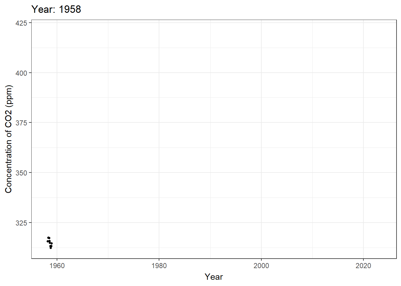
20.3.3 Example 2: Animating a ggplot map
Import warehouse data for Riverside County only - let’s limit the scope.
WH.url <- 'https://raw.githubusercontent.com/RadicalResearchLLC/WarehouseMap/main/WarehouseCITY/geoJSON/finalParcels.geojson'
plannedWH.url <- 'https://raw.githubusercontent.com/RadicalResearchLLC/PlannedWarehouses/main/plannedWarehouses.geojson'
#import planned warehouses and add a dummy year built column
plannedWarehouses <- st_read(plannedWH.url) %>%
  st_transform(crs = 4326) %>%
  mutate(year_built = 2025)
Reading layer `plannedWarehouses' from data source
`https://raw.githubusercontent.com/RadicalResearchLLC/PlannedWarehouses/main/plannedWarehouses.geojson'
using driver `GeoJSON'
Simple feature collection with 456 features and 1 field
Geometry type: MULTIPOLYGON
Dimension: XY
Bounding box: xmin: -118.1749 ymin: 33.63064 xmax: -116.1352 ymax: 34.73309
Geodetic CRS: WGS 84#import warehouses for Riverside county
warehouses <- st_read(WH.url) %>%
filter(county == 'Riverside') %>%
st_transform(crs = 4326) %>%
## Let's only show the last 40 years
mutate(year_built = ifelse(year_built < 1980, 1980, year_built)) %>%
select(apn, year_built, geometry) %>%
bind_rows(plannedWarehouses)Reading layer `finalParcels' from data source
`https://raw.githubusercontent.com/RadicalResearchLLC/WarehouseMap/main/WarehouseCITY/geoJSON/finalParcels.geojson'
using driver `GeoJSON'
Simple feature collection with 8606 features and 11 fields
Geometry type: POLYGON
Dimension: XY
Bounding box: xmin: -118.8037 ymin: 33.43325 xmax: -114.4085 ymax: 35.55527
Geodetic CRS: WGS 84head(warehouses)Simple feature collection with 6 features and 3 fields
Geometry type: POLYGON
Dimension: XY
Bounding box: xmin: -117.5982 ymin: 33.87729 xmax: -117.5314 ymax: 33.97309
Geodetic CRS: WGS 84
apn year_built name geometry
1 115060057 1980 <NA> POLYGON ((-117.5532 33.8775...
2 115050036 2000 <NA> POLYGON ((-117.5447 33.8807...
3 115670012 1999 <NA> POLYGON ((-117.5314 33.8813...
4 144010061 2018 <NA> POLYGON ((-117.5976 33.9730...
5 144010065 1980 <NA> POLYGON ((-117.5954 33.9714...
6 144010064 2018 <NA> POLYGON ((-117.5946 33.9717...Make a basic warehouse map near my house using ggplot and geom_sf. Figure 20.5 shows a basic map of warehouses in ggplot.
ggplot(data = warehouses) +
  geom_sf(color = 'brown') +
  coord_sf(xlim = c(-117.35, -117.1),
           ylim = c(33.8,33.95), crs = 4326) +
theme_void() 
Let’s animate it. We’ll add a second step to control the animation speed and frames. First, we add transition_time() and shadow_mark() in a way identical to our CO2 figure.
Pass the ggplot code chunk into a variable. This variable is then run through an animate() function to control the frame rate and number of frames displayed.
Figure 20.6 shows the time series animation.
data4map <- ggplot(data = warehouses) +
  geom_sf(color = 'brown', fill = 'brown') +
  coord_sf(xlim = c(-117.35, -117.1),
           ylim = c(33.8,33.95), crs = 4326) +
  theme_void() +
  transition_time(year_built) +
  shadow_mark(past = TRUE, color = 'grey20', fill = 'grey') +
  labs(title = 'Year: {round(frame_time, 0)}')

animate(data4map, nframes = 46, fps = 3, end_pause = 10)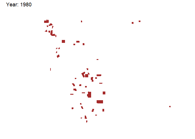
Excellent! We can also add an underlying map of jurisdictions or a tile layer to make it a bit prettier.
We’ll use ggmap and get_stamenmap() to provide a base map. Figure 20.7 adds a background with some streets and labels.
library(ggmap)
bkgd <- get_stamenmap(bbox = c(left = -117.35,
          bottom = 33.8, right = -117.1, top = 33.95),
          zoom = 12,
          maptype = 'toner-lite')

data4map2 <- ggmap(bkgd) +
  geom_sf(data = warehouses, color = 'black', fill = '#653503',
          inherit.aes = FALSE) +
  coord_sf(xlim = c(-117.35, -117.1),
           ylim = c(33.8,33.95), crs = 4326) +
  theme_void() +
  transition_time(year_built) +
  shadow_mark(past = TRUE, color = '#653503', fill = 'grey') +
  labs(title = 'Year: {round(frame_time, 0)}')

animate(data4map2, nframes = 47, fps = 3, end_pause = 10)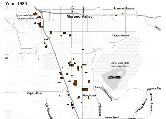
20.4 Animations in Shiny using sliderInput()
20.4.1 Example 3 - Animate Old Faithful Histogram
Create a new shiny App called ‘animate.R’ as shown in Section 19.3.2.
This should create a new Shiny App using the Old Faithful Geyser data. We’re going to animate this using the following argument within the sliderInput() function.
animate = TRUE.
The code chunk within the app should look like this, starting at line 21 on my machine:
            sliderInput("bins",
                        "Number of bins:",
                        min = 1,
                        max = 50,
                        value = 30,
                        # NEW ARGUMENT HERE!
                        animate = TRUE)
If we run the app by pressing the Run App button, a shiny App should pop-up. I’ll show that within the Shiny App. A blue play button will appear on the bottom-right of the slider. Pressing the play button advances through the slider increments and updates the histogram.
Easy!
There are additional options for controlling the interval rate and whether it loops.
We can modify the code to show that.
            sliderInput("bins",
                        "Number of bins:",
                        min = 1,
                        max = 50,
                        value = 30,
                        # NEW ARGUMENT HERE!
                        animate = animationOptions(
                          loop = TRUE, interval = 300)
                        )