10 EJ - Warehouse Mapping Case Study - Airport Gateway
Today we will focus on the practice of creating polygons for use in a warehouse mapping visualization.
The Airport Gateway Specific Plan is a Program Environmental Impact Report (EIR) under CEQA (California Environmental Quality Act). Earthjustice asked for the Redford Conservancy and Radical Research LLC to write technical responses to the EIR. These are due by March 14, 2023.
10.1 Airport Gateway Project
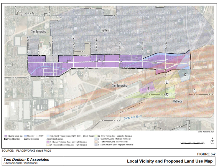
The Airport Gateway Project is a development on about 678 acres of land just north of the San Bernardino Airport (i.e., the old Norton Air Force Base) between 3rd Street and 6th street between Tippecanoe Avenue and the I-210 freeway. Figure 10.1 shows the basic layout of the plan.
10.2 Cumulative Impacts
Today, I am going to ask you all to help with a cumulative impacts analysis (for the project. Under CEQA Section 15355, cumulative impacts are defined as ‘two or more individual effects, when considered together, are considerable or which compound or increase other environmental impacts…The cumulative impact from several projects is the change in the environment which results from the incremental impact of the project when added to other closely related past, present, and reasonably foreseeable future projects.’
A cumulative impacts analysis identifies the past, present, and probable future projects that should be included in the EIR.
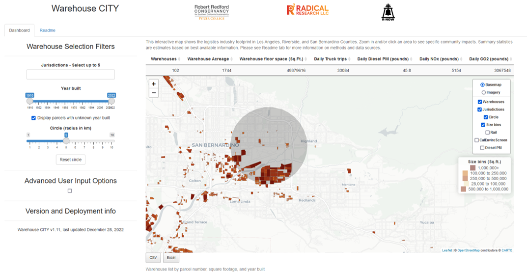
The Warehouse CITY tool is designed to do exactly this. However, it only includes the existing (i.e., past and present) warehouses. It does not include the probable future projects.
Within 3.1 miles (5 km) of the project, the tool indicates that there are already 1740+ acres of warehouses. Using the default warehouse floor-area-ratio assumption of 0.65, and a truck trip generation rate of 0.67 trucks per 1000 square feet of warehouses, this results in an estimate of over 30,000 truck trips daily from this region. Figure 10.2 shows the output. You can alter the circle size or move the starting point and see how sensitive the estimate is to the default assumptions. Also, you can zoom in with aerial imagery and see that a few warehouses aren’t identified in this analysis.
10.3 Visualization - Drawing a Polygon
Note, this is the least sophisticated approach possible. There are almost certainly machine-learning ways to do this systematically, but I am not an image processing expert. If any of you have desire to do more, I can point you to some resources for this. If you figure it out, the military and rich developers will want to employ you.
10.3.1 Load libraries
10.3.2 Manually Identify the Polygon Vertices.
Open Google Maps or an equivalent mapping tool with satellite imagery and an ability to click on a location and retrieve a decimal degree location.
Find a vertex on the map - input longitude and latitude into a list in the form c(lng, lat).
Do that for all the vertex points and bind them together as a list of lists as shown in the code below.
AirportGateway1 <- rbind(
c(-117.26095, 34.11023),
c(-117.26095, 34.10611),
c(-117.25946, 34.10484),
c(-117.24921, 34.10484),
c(-117.24455, 34.1069),
c(-117.22594, 34.1069),
c(-117.21669, 34.1069),
c(-117.21262, 34.1069),
c(-117.21248, 34.10476),
c(-117.20905, 34.10528),
c(-117.20532, 34.10613),
c(-117.1997, 34.10617),
c(-117.1998, 34.1116),
c(-117.20086, 34.11073),
c(-117.2117, 34.11074),
c(-117.21757, 34.109),
c(-117.21757, 34.11032),
c(-117.24932, 34.11012),
c(-117.24932, 34.10847),
c(-117.25412, 34.10847),
c(-117.25412, 34.11012),
c(-117.26095, 34.11023)
)Look at the AirportGateway table - it looks like a list of point coordinates.
We need one more bit of code to convert that into a polygon. It is a bit complicated.
AirportGatewaySP <- st_sf(
name = 'Airport Gateway Specific Plan Area',
geom = st_sfc(st_polygon(list(AirportGateway1))),
crs = 4326
)The name is our label for the polygon, so that’s easy. The crs is the coordinate reference system, in this case WGS84 = 4326 for easy display in leaflet.
The geom is the geometry. Three functions are applied - list() which converts the AirportGateway1 table to a list, st_polygon() which returns a polygon from a list of coordinates, and st_sfc() which verifies the contents and sets its class.
Polygons always have to start and end with the same vertex to be a closed loop.
Now we should display it to make sure it looks correct. Figure 10.3 shows the attempt.
leaflet() %>%
addTiles() %>%
addPolygons(data = AirportGatewaySP,
color = 'darkred',
fillOpacity = 0.6,
weight = 1)That looks pretty close.
Now let’s add the warehouse layer from last week to see it in context of the existing warehouses.
First import the warehouse dataset. Unlike last week, we’ll include only San Bernardino County instead of Riverside County. If you still have your data from last week loaded, this will replace that dataset with this one because I used the warehouses data frame name in both cases. If you want to avoid that, call this dataset set warehouses2 or something to make it unique.
WH.url <- 'https://raw.githubusercontent.com/RadicalResearchLLC/WarehouseMap/main/WarehouseCITY/geoJSON/finalParcels.geojson'
warehouses <- st_read(WH.url) %>%
filter(county %in% c('San Bernardino', 'Riverside')) %>%
st_transform("+proj=longlat +ellps=WGS84 +datum=WGS84")Reading layer `finalParcels' from data source
`https://raw.githubusercontent.com/RadicalResearchLLC/WarehouseMap/main/WarehouseCITY/geoJSON/finalParcels.geojson'
using driver `GeoJSON'
Simple feature collection with 8606 features and 11 fields
Geometry type: POLYGON
Dimension: XY
Bounding box: xmin: -118.8037 ymin: 33.43325 xmax: -114.4085 ymax: 35.55527
Geodetic CRS: WGS 84Now let’s add the existing warehouses to the map. Let’s also use setView() to zoom in on our area of interest cause San Bernardino County is really big.
?fig-moreWH shows the new project in a bit more context.
leaflet() %>%
addTiles() %>%
addPolygons(data = AirportGatewaySP,
color = 'darkred',
fillOpacity = 0.6,
weight = 1) %>%
addPolygons(data = warehouses,
color = 'brown',
weight = 1) %>%
setView(lng = -117.20905, lat = 34.10528, zoom = 12)Yikes, that underlying map is a bit too busy. Let’s switch to a different provider tile and zoom out a tiny bit further to the West.
?fig-finalWH
leaflet() %>%
addTiles() %>%
addProviderTiles(provider = providers$CartoDB.Positron) %>%
addPolygons(data = AirportGatewaySP,
color = 'darkred',
fillOpacity = 0.6,
weight = 1) %>%
addPolygons(data = warehouses,
color = 'brown',
weight = 1) %>%
setView(lng = -117.34, lat = 34.10528, zoom = 11)10.3.3 In-Class Exercise
There are a lot of other warehouses regionally that are planned, approved, and under construction. I want to show as many of them as possible on a map to indicate that this project is not including appropriate cumulative impacts in its analysis.
There’s a google spreadsheet that is tracking many of the bigger warehouse projects in the region. I’m hoping to have all of you work together to individually add a few warehouses each to this map, which we then combine to make a single planned warehouses map layer. It would be amazing to have this to bludgeon the agency and decision-makers with.
Steps for adding a warehouse -
- Put your name on the project.
- Look up the EIR on ceqanet using google
- Find the site map
- Create your initial polygon table - name it something related to the warehouse project
- Run the polygon code
st_sf(st_sfc(list())) - Check if the polygon looks right by mapping it in
leaflet - If everything is good, we’ll add it to a google doc to combine the warehouse polygons and make a mega-map
10.3.4 Update - Planned Warehouses Map
Here’s the current geospatial file with the planned warehouses in the region. This is a great resource that is going to make a big difference in future EIR responses!
I’ve uploaded the current best list and the method for generating it to github. The geojson file and current map is here. Access the file using this code.
plannedWH.url <- 'https://raw.githubusercontent.com/RadicalResearchLLC/PlannedWarehouses/main/plannedWarehouses.geojson'
plannedWarehouses <- st_read(plannedWH.url) %>%
st_transform("+proj=longlat +ellps=WGS84 +datum=WGS84")Reading layer `plannedWarehouses' from data source
`https://raw.githubusercontent.com/RadicalResearchLLC/PlannedWarehouses/main/plannedWarehouses.geojson'
using driver `GeoJSON'
Simple feature collection with 456 features and 1 field
Geometry type: MULTIPOLYGON
Dimension: XY
Bounding box: xmin: -118.1749 ymin: 33.63064 xmax: -116.1352 ymax: 34.73309
Geodetic CRS: WGS 84Let’s load htmltools to allow for cool mouseover label interactivity.
And now let’s make a map showing existing and planned warehouses. Figure 10.4 shows the result.
leaflet() %>%
addTiles() %>%
addProviderTiles(provider = providers$CartoDB.Positron) %>%
addPolygons(data = plannedWarehouses,
color = 'purple',
fillOpacity = 0.6,
weight = 1,
label = ~htmlEscape(name)) %>%
addPolygons(data = warehouses,
color = 'brown',
weight = 1) %>%
setView(lng = -117.3, lat = 34, zoom = 10)